Overview
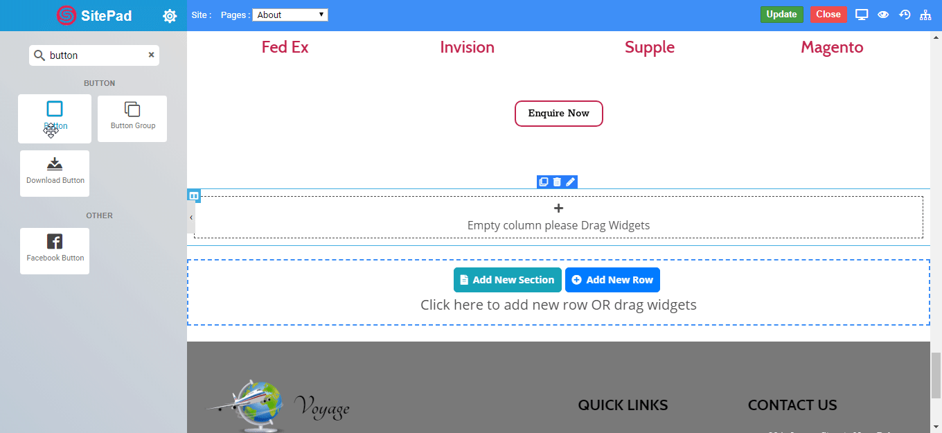
The Button Widget allows you to easily design and customize the buttons without any other plugins or shortcodes.
Inside button you can even put text, icon and can modify or customize as per your need.
Options
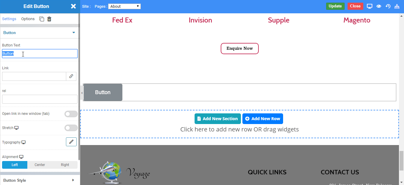
Content
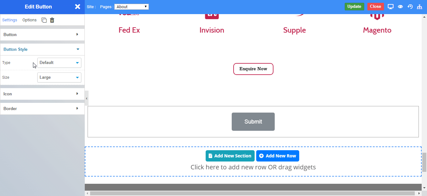
Button Style
You can style your button with the following types and size.
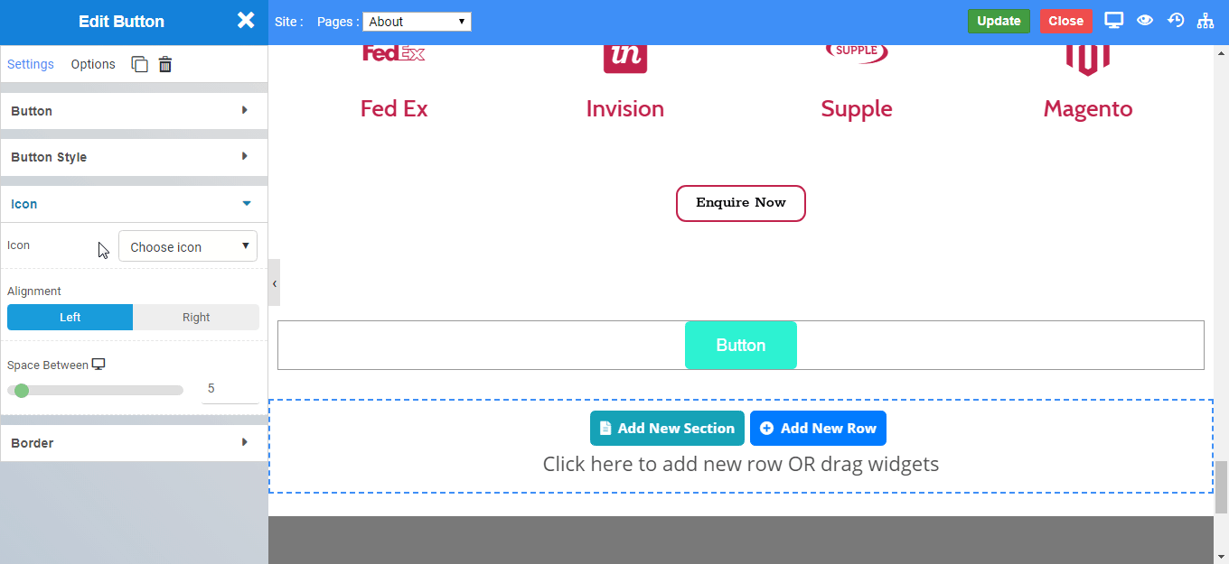
Icon
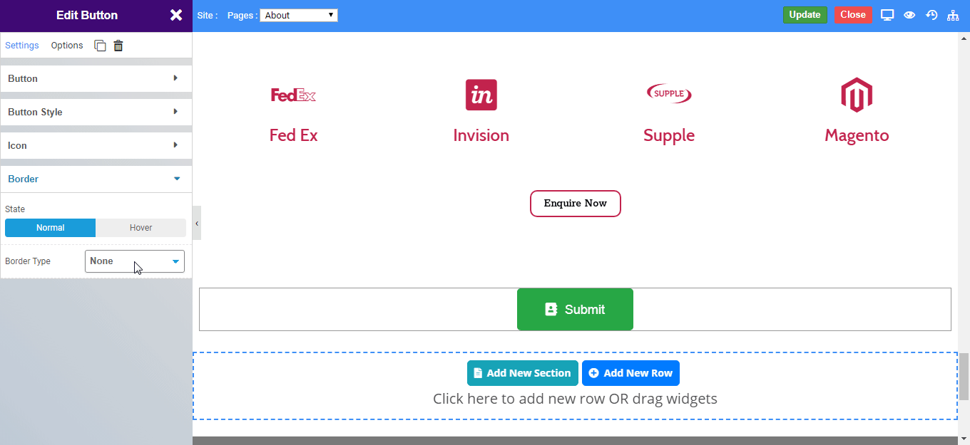
Border
Solid Border
Double Border
Double Border
Dashed Border
Groove Border