Buy
Contact Form

Overview

This Contact Form widget allows you to create form which can be use to communicate with site owner.

This widget provides different type of form fields and styling option which helps create a contact form in a easiest way possible.

Options

Contact Form
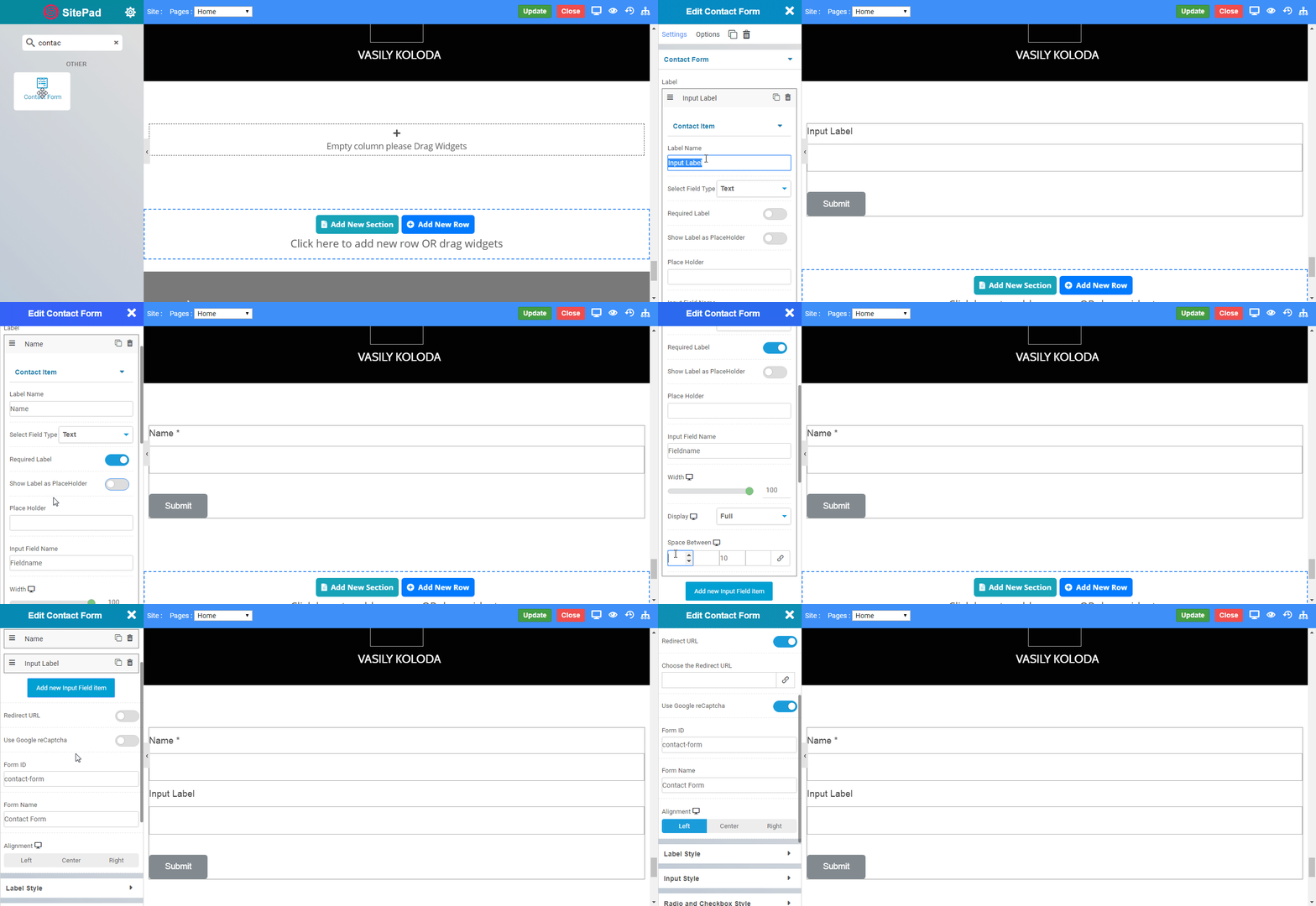
  • Form Fields : This option allows you to create form using the form fields. It has all types of input field which are use to create a contact form.
  • Label : This option allows you to label the input field.
  • Field Type : This option allows you to select the type of input field. The options include text, textarea, number, telephone, email, radio, checkbox, select.
  • Text : This option creates a simple text field inside form.
  • Textarea : This option creates a textarea inside form. You can set the number of rows.
  • E-Mail: This option creates a text field with email type. It has validation for email.
  • Telephone: This option creates a text field with telephone type.
  • Number: This option creates a text field with number type.
  • Radio: This option creates a radio buttons inside form, it allows you to select single option from list of options.
  • Checkbox: This option creates a check boxes inside form, it allows you to select any number of options from list of options.
  • Select: This option creates a dropdown list of options inside form.
  • File: This option creates a file input field inside form.
  • Label: This option simply displays text inside form.
  • Required Label : Enable this option to to set the field as a required field.
  • Placeholder : This option will display the text inside your form field.
  • Show Label as Placeholder : Enable this option to display the label as placeholder inside your form field.
  • Input Field Name : This option allows you to set the name for your form field.
  • Accept file: Specify a comma separated list of allowed file extensions for file upload. for eg. .jpg,.pdf,.doc,.mp4, etc.
  • Width : Set the suitable width for your form field.
  • Display : Select the display type for your form field. The options include full, inline.
  • Full : Select this option and then form field will start on new line and it will take full width.
  • Inline : Select this option and the form field will not start on a new line and only takes up as much width as required.
  • Space Between : This option allows you to manage space around the form field.
  • Redirect URL : Enable this option to set an URL for form redirection after submit.
  • Google Re-captcha : Enable this option to display google captcha inside your form.
  • Form ID : This option allows you to set form id for your form.
  • Alignment : Set the alignment for the form eg. left, center, right.
  • Left: Selecting this option will align the form to the left.
  • Center: Selecting this option will align the form to the center.
  • Right: Selecting this option will align the form to the right.
contactform1

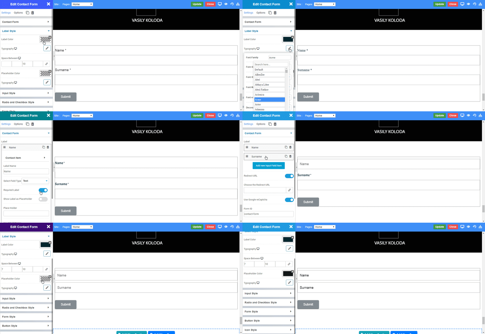
Label Style

  • Color:  Select the color for field label using this option.
  • Typography:  Set the typography eg. Font family, Font size, etc. of the field label.
  • Space Between:  This option allows you to manage space between field label and form field.
  • Placeholder Color:  This option allows you to manage color of placeholder.
  • Typography:  Set the typography eg. Font family, Font size, etc. of the placeholder.
contactform2

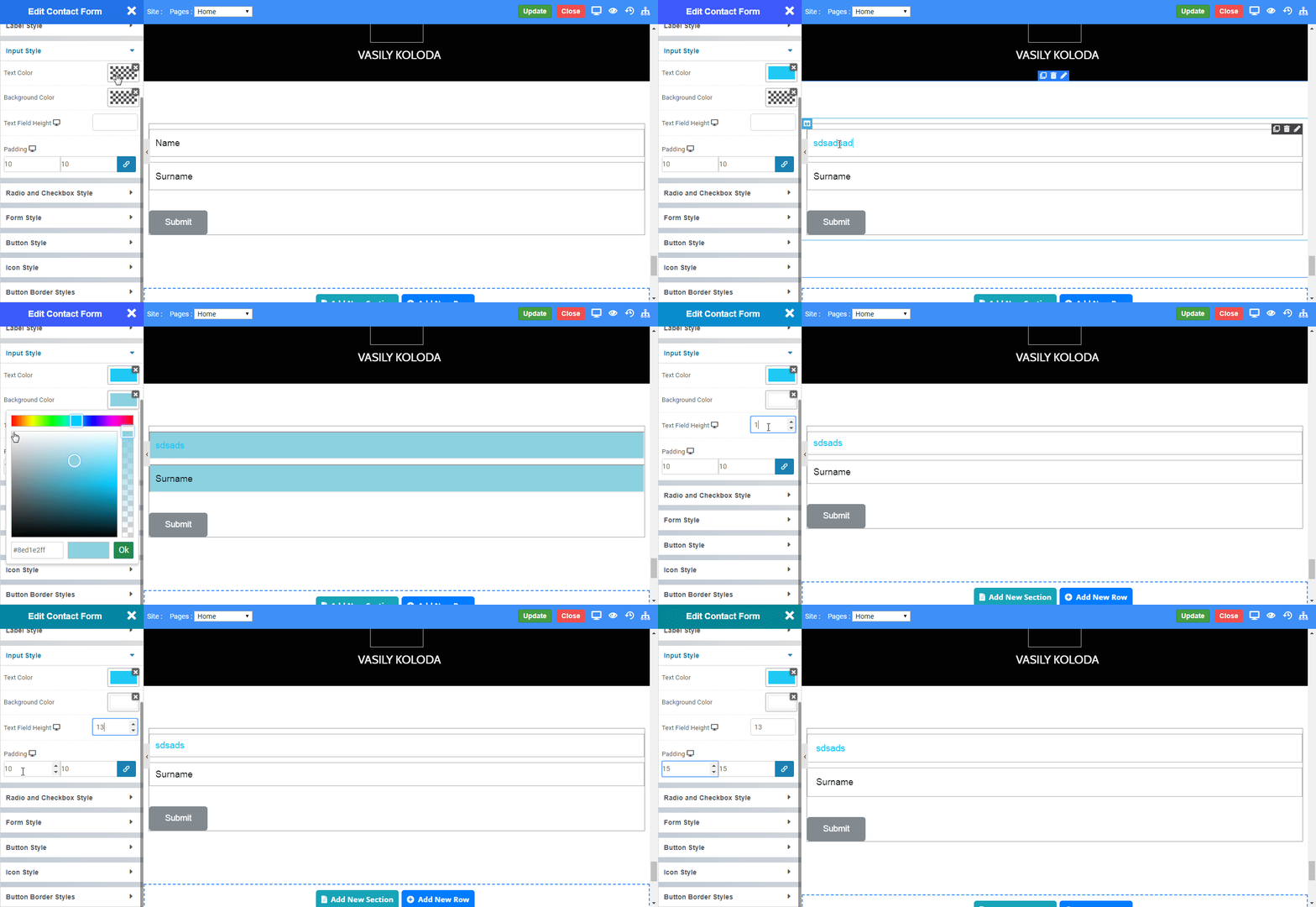
Input Style

  • Text Color:  This option allows you to manage text color inside form fields.
  • Background Color:  Set the background color for form fields.
  • Text Field Height:  This option allows you to manage height of form fields.
  • Padding:  This option allows you to manage the space inside of form fields.
contactform3

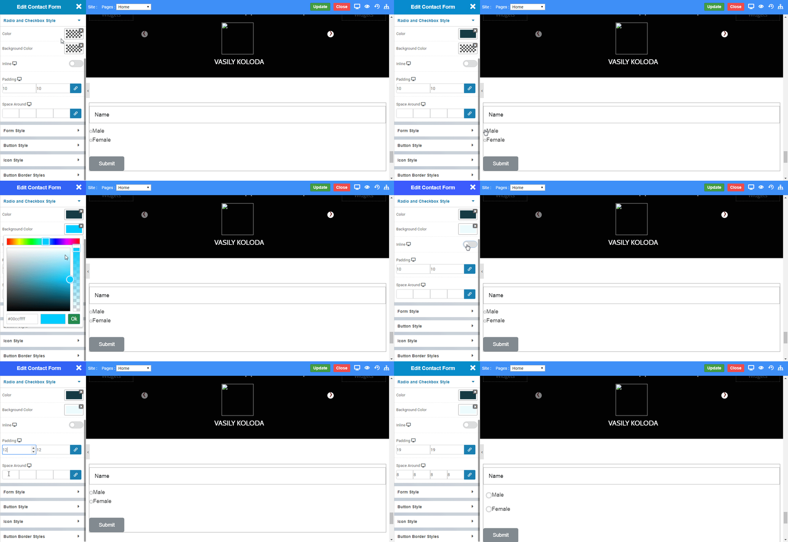
Radio and Checkbox Style

  • Color:  This option allows you to set color for radio buttons and checkboxes.
  • Background Color:  Set the background color for radio buttons and checkboxes.
  • Inline:  This option allows you to display all the radio and checkboxes inline.
  • Padding:  This option allows you to manage space inside radio and checkboxes.
  • Space Around : This option allows you to manage space around radio and checkboxes.
contactform4

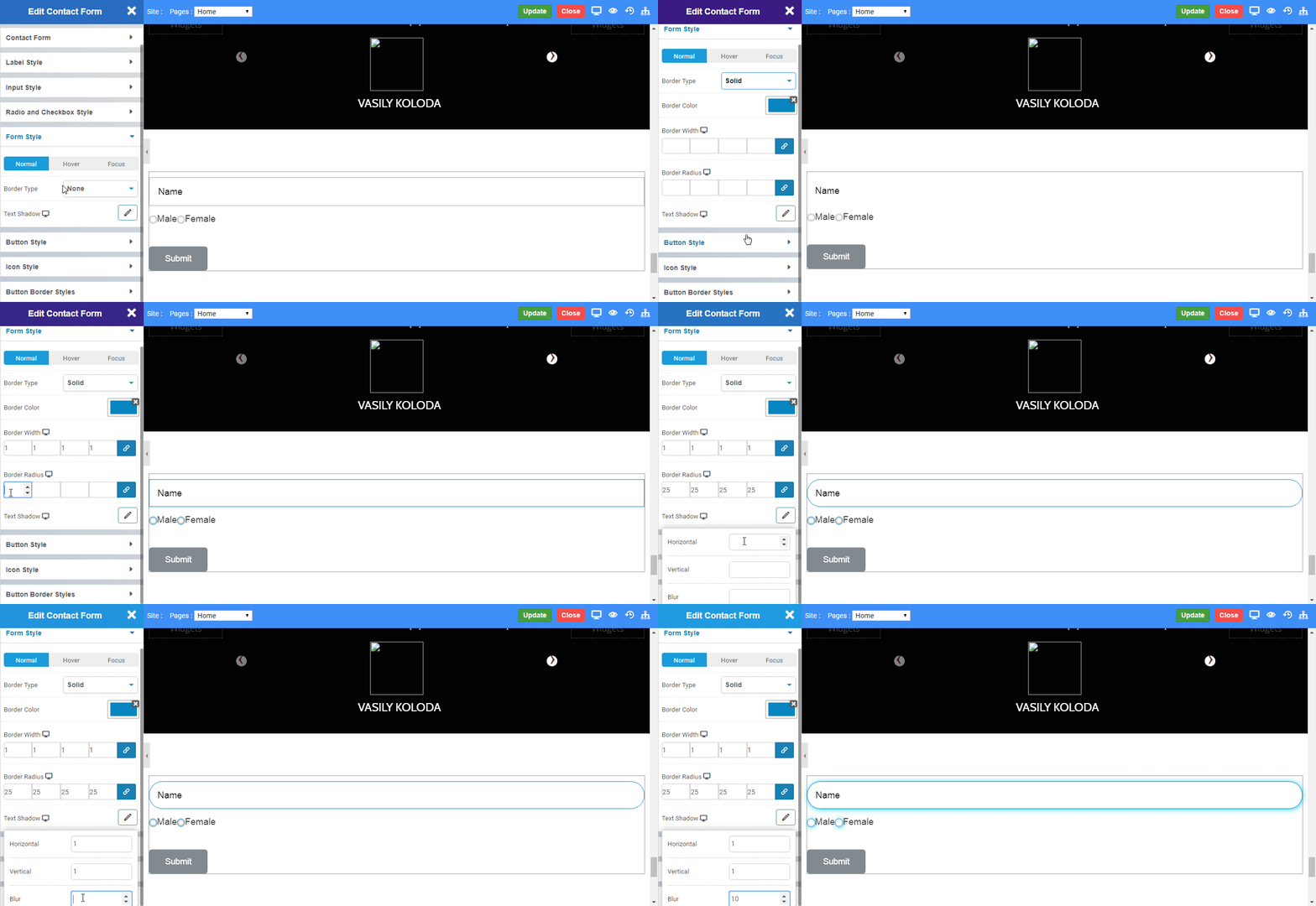
Form Style

  • State : Select the state to design the form style. The options include Normal, Hover.
  • Border Type: Choose the type of border you want to display. CLICK HERE to see the type of border.
  • Border Color: Set the color of the border.
  • Border Width: Set the width of the border.
  • Border Radius: Set the radius of the border.
  • Box Shadow:  This option allows you to select the box shadow around the form field.
contactform5

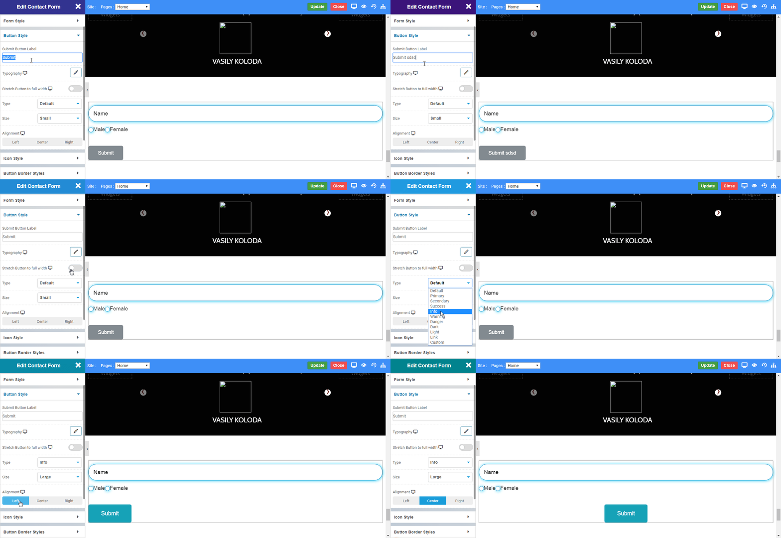
Button Style

  • Submit Button Label:  This option allows you to add label for your button.
  • Stretch Button to full width :  Enable to set the button width as 100% of your display resolution.
  • Button Type: Choose the type of button you want to display. CLICK HERE to see the types of button.
  • Button Size: Choose the size of button you want to display. CLICK HERE to see the size of button.
  • Alignment : Set an alignment for button. eg. left, center, right.
  • Left: Selecting this option will align the button to the left.
  • Center: Selecting this option will align the button to the center.
  • Right: Selecting this option will align the button to the right.
contactform6

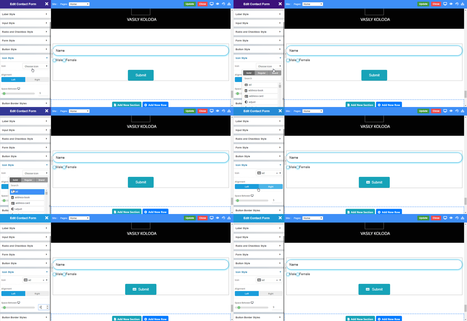
Icon Style

  • Icon: Choose the icon you want to display.
  • Alignment : Set an alignment for icon. eg. left, right.
  • Space Between: Set the space between button text and icon.
contactform7

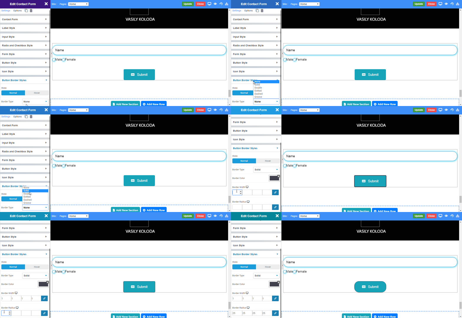
Button Border Style

  • State : Select the state in which border has to be displayed. The options include Normal, Hover.
  • Border Type: Choose the type of border you want to display. CLICK HERE to see the type of border.
contactform8

Message Box

  • Position: Set the alignment for the Message Box. eg. top, bottom.
  • Top: Selecting this option will align the Message Box to the top.
  • Bottom: Selecting this option will align the Message Box to the bottom.
  • Padding: This option allows you to manage the space inside of message box.
  • Margin: This option allows you to set the outer spacing of message box.
  • Success: This option allows you to customize success message box.
  • Failed: This option allows you to customize failed message box.
  • Text Color: This option allows you to manage text color inside appropriate message box.
  • Background Color: Set the background color for appropriate message box.
  • Border Type: Choose the type of border you want to display. CLICK HERE to see the type of border.

Mail Template

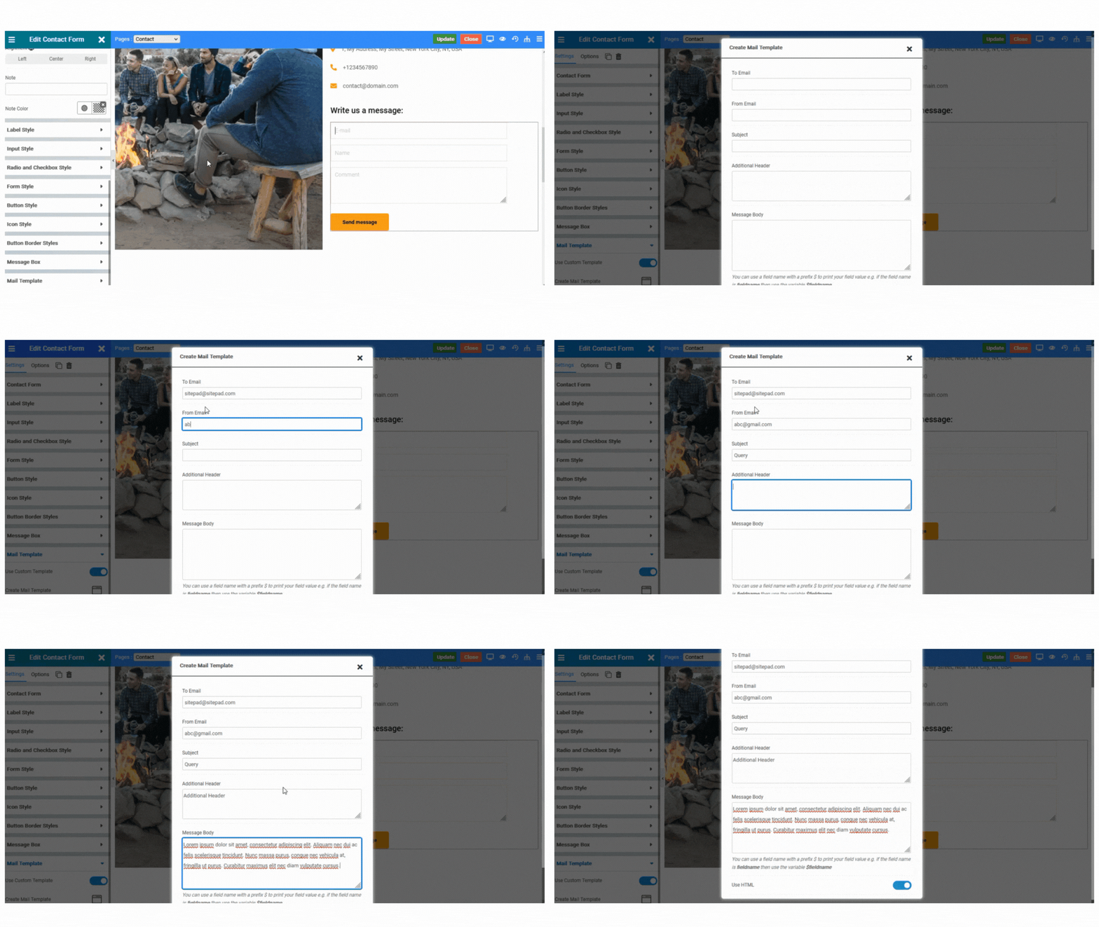
  • Use Custom Template: Enable the toggle to set custom template to the mail.
  • Create Mail Template: This option overrides the contact form settings and allows you to create custom mail template for the specific contact form.
  • TO Email: Enter the email address to whom you want to send the mail. You can add multiple email addresses seperated by Comma(,).
  • FROM Email: Enter the email address from which email address you want to send the mail.
  • SUBJECT: Enter the Subject of the mail.
  • Additional Headers: Enter if you want any Additional Header to be send with the email.
  • Message Body: Enter the Message you want to send with the Mail.
  • Use HTML: Enable the toggle to use HTML tags to create custom designs in the email.
custom-template
    Was this page helpful?
    Newsletter Subscription
    Subscribing you to the mailing list