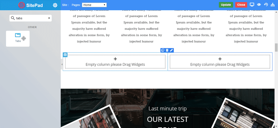
The Tabs Widget allows you to separate your information into tabs, either horizontally or vertically, it allows you to use icons next to the title.
Options
Tabs
Default Active Tab : The tab which you want to show active, click on that tab and enable the default active tab button by just clicking on that slide button.
Icon : Choose the icon which will set next to the title of the tab.
Title : Enter the text to the title of the tab.
Edit Rich Text : Enter the description of tab.
Vertical Tabs : Click slide button to show the tabs vertically.
Auto Rotate : Select the time available in seconds to Rotate the active on tabs.
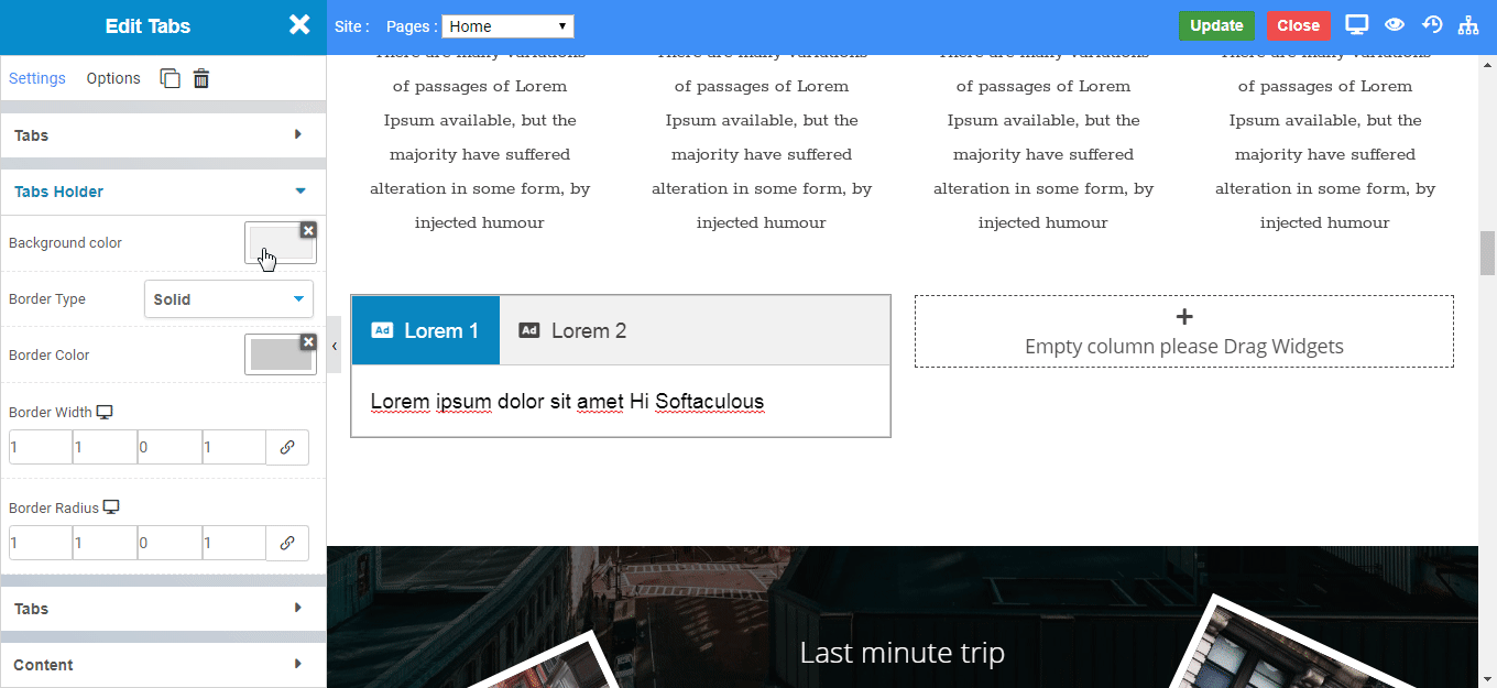
Tabs Holder
Background Color : Set the tab holder background color.
Border Type : Select the border type. CLICK HERE to see types of border.
Border Color : Set the border color of the tab.
Border Width : Set the border width of the tab.
Border Radius : Set the border radius of the tab.
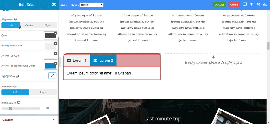
Tabs
Alignment : Align the tabs to left, right or center.
Color : Set the color of tab title text
Background Color : Set the background color of tab.
Active Tab Color : Set the active tab background color.
Typography : Set the typography of tab title.
Icon Position : Set the icon to appear left or right to the tab title.
Icon Spacing : Set the space between icon and the tab title
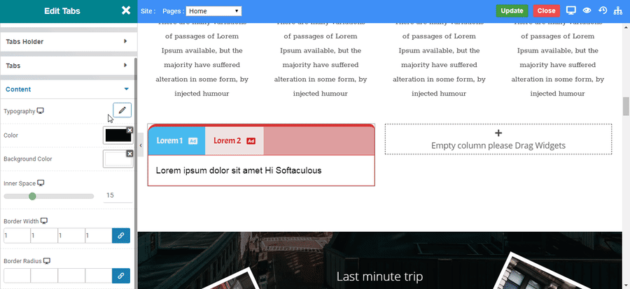
Content
Typography : Set the typography of tab content.
Color : Set the content text color.
Background color : Set the content background color.
Inner Space : Set the space around the content.
Border Width : Set the border width of content area.
Border Radius : Set the border radius of content area.